Microsoft Build 2022
Microsoft Build is an annual Tech Conference where speakers for the company go to talk about further advancements with the Microsoft brand and its products. The conference has a new design every year that reflects the look of the company while showing innovation and ease of use in its animations.
I looked to create an Opener for the 2022 conference with this in mind while still creating something new and beautiful. Abstraction is something I like exploring so this was a fun challenge to take on.
Animation

My Ideas
I wanted to come up with two directions for the opener: one that was more on brand with Microsoft and another that felt still in line with the design language of the company but more experimental for them.
The result was Vibrance and Clear, two very different visuals in 3D space that used color and shape to communicate to the audience key descriptions for the Microsoft company.

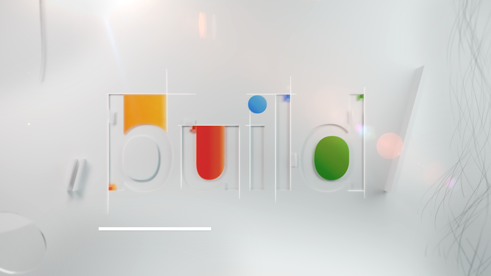
Vibrance
We would use modular shape design to focus on form follows function. Each shape relates to descriptive words for Microsoft’s brand as well as how the shapes are used in each composition. The colors are more playful to show the variety of products Microsoft offered, and 3D type will be used from moment to moment to eventually spell out the conference title “Build.”


Clear
On brand with Microsoft, the overall shape language is meant to feel very geometric utilizing the squares of the Microsoft logo. 2D graphics would be small additions to the visuals to add a sense of UI design as well as help incorporate type in a clean way. The color palette would consist of red, green, blue, and white referencing color pixels in computers and the compositions/visuals would communicate keywords Microsoft uses to describe the company and its products.
Notes:
Both directions feel on brand with Microsoft, but Clear is the better direction to move forward with. Try to come up with a visual script for the piece to help with visuals and experiment with using keywords in place of single letterforms in the 2D graphics. Also, consider audio and how that can enhance the visual while still letting the compositions communicate keywords.
Chosen Direction
I was so happy to get to move forward with Clear because it allowed for more experimentation with abstract worlds. Now I had to come up with a proper storyboard as well as continue making style frames for the piece. I started with the visual script and worked with an audio specialist, Kelly Warner, to create a custom track for the piece.
The audio along with the script would help me create the visuals and brainstorm motion. Previous openers were visually appealing, but could have been pushed a little further to represent Microsoft, so I came up with a piece that had four visual characters all connected through animation, shape language, and composition.
Style Frames


At this point, I was so lucky to get to meet with a Ringling Graduate who works at Microsoft, Alexis Copeland. Alexis is an Art director at the company so I was so happy to get to show her my progress and get her thoughts.
She had some incredible advice about how to make the project more successful by cutting certain shots and tightening up the edit and she also was able to answer all my questions about the Microsoft Brand.

I was able to create a first pass to show how the scenes would look altogether.
Notes:
The animation is nice but needs to be polished. Try adding more graphic transitions and cuts to the piece so that each scene flows from one to the next better sort of like how it’s done from the single cube to the ribbons. Also, finish up the remaining scenes so it can be seen in its final form fully realized.
Refinement
I experimented with different camera moves from scene to scene and how the subject objects in each frames could have intentional animation that flows from one scene to the next.
I created a second pass with these improved animations but was unable to touch one of the set of scenes. I hadn’t started any render tests but I had started some texture tests.
My second pass was a huge improvement and now I was able to look into textures for a final pass before refinement.
Notes:
The animation is now working so much better. The set of scenes that was untouched feels unnecessary in the piece overall so try cutting it and bringing elements into the logo lockup. That way you can transition from the circular shape into the piece that fit’s into the “i” hole. Start focusing on renders now and try polishing animation secondary to lighting, texturing, and compositing.
The Finale
This was one my most ambitious and time consuming projects I’ve ever had to complete. In the end, I’m very proud of all that I learned and accomplished with this animation.
From particle simulations in Houdini to dynamic camera transitions, there was a lot of new techniques I looked to incorporate into this piece to make it one of the more special videos I’ve created.
Animation